
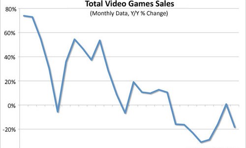
The chart pictured above has been making its way around the internet over the past few days, and seems to be causing a stir among videogame publications seeking to… cause a stir. The general message from most outlets is the cataclysmic claim that “teh gam3z r doooomed” in light of the current economic climate.
They obviously can’t read and interpret charts very well.
When you look at this chart, the first thing you notice is obviously the foreboding downward slope of the data points from month to month, but the most important information here is what these points actually represent. These are not concrete sales figures, but, as listed at the top of the chart, “Y/Y % Change.” This little term is a more abstract way of saying that each month’s sales data is a comparison to the sales from the same month in the previous year, presented as a percentage.
Also worth noting is that the chart’s y axis (the vertically arranged part) ranges from a 40% decrease to an 80% increase, leaving the no-change line of 0% relatively close to the bottom, and that the time frame under observation begins at September 2007, 10 months after the last entries into the current console generation landed at retail. So, this means that the chart is dealing with mostly POSITIVE numbers and is only looking at a very small part of modern gaming history.
If we examine the dips in the data, it’s easy to see that between March and August of 2009 appear to have been be the roughest times for the industry, but let’s not forget how the information is presented — these numbers are a comparison to the previous year. Looking back at the same period in 2008 shows that for most of that time, videogame sales maintained a steady and sizeable 40-60% increase compared to those months in 2007, dipping to only a 10-30% improvement at the period’s tail end. It stands to reason that the numbers would show a decline in the following year when compared to such a boom, but still, even a 20% decrease from what had been a 50% increase in the previous year remains a net improvement.
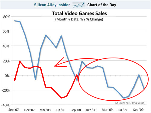
To make this concept clearer, I’ve edited the chart, overlaying the September 2007 – September 2008 data with those from September 2008 – September 2009. Comparing the blue and red lines makes it even more obvious that the number sets from each successive year will naturally oppose one another simply as a result of the type of data we are looking at — a percent change.
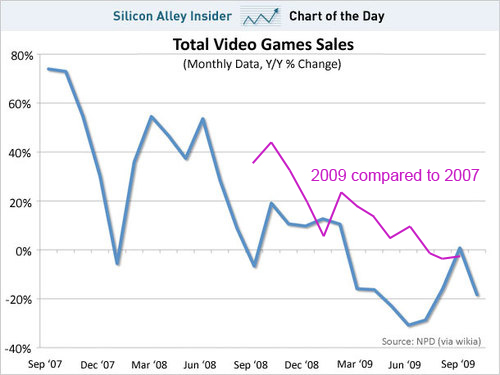
Even without the decades of sales figures preceding September 2007, it shouldn’t be difficult to estimate the change from 2007 to 2009. Simply splitting the difference between the red and blue lines above gives an approximation of where sales from 9/08-9/09 stand as compared to those from 9/07-9/08. The purple line below represents that estimate, shifted into place on the chart for the later time period. Notice that all but the last few months show % increases, meaning that videogame sales have indeed gone up since 2007 and earlier.
If anyone bothers to take a look at where the video game industry stood in the early part of the century, the 1990s, or the 1980s, I’m sure they will find that it is far from being “in decline.” Unless of course you call anything other than skyrocketing a decline, that is — in that case, sure, this is a decline from the astronomical growth the industry has consistently experienced over the last 25 years.